The internal dashboard that took Malayali Kada’s weekly delivery off pen and paper.
Every week, five co founders grouped orders by hand, wrote every packing slip, drew the route on paper and worked out profit on a calculator. Spreadsheets, Shopify’s dashboard and inventory apps all failed. I designed Temple in Figma and built it with Claude Code.
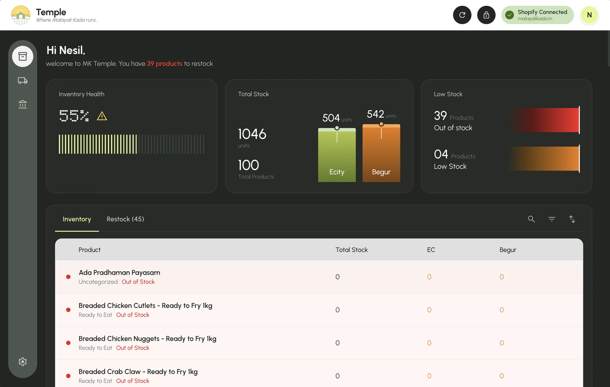
Stock across two locations, and the list of what to restock.
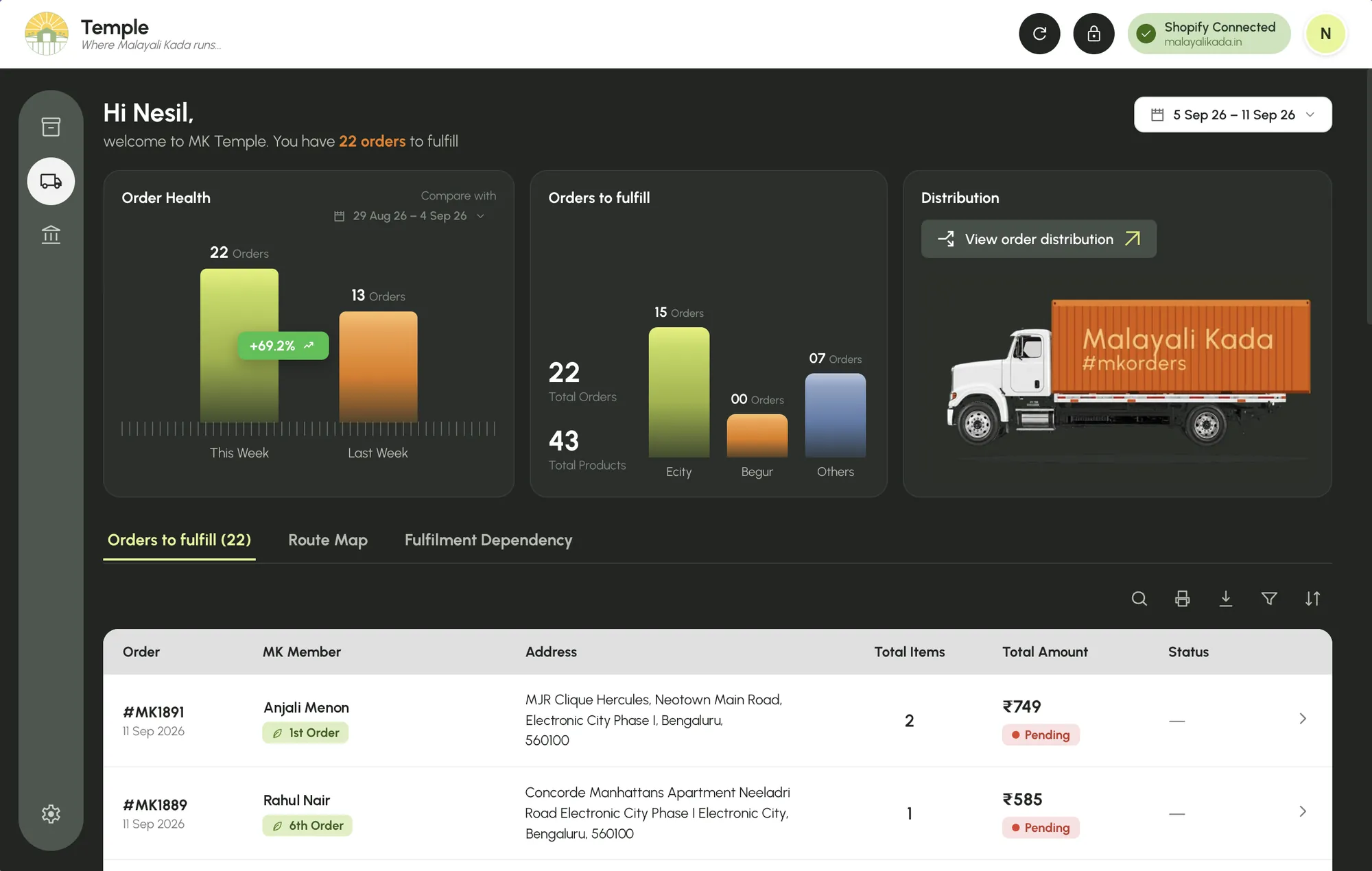
Orders, sourcing, packing slips, routes.
This page follows DeliveryA weekly ledger with cost frozen per order.
Malayali Kada sells homemade and small batch Kerala food to Malayalis in Bengaluru. Orders come through a Shopify store. Stock sits in two places, Electronic City and Begur, and delivery runs once a week, by choice.
By May 2026 the store had outgrown the way we ran it: WhatsApp groups, spreadsheets, and pen and paper. There was no budget for an analytics product or a delivery app. So I designed the tool and built it. We named it Temple, after the building at the centre of a Kerala village.
Shopify’s analytics dashboard is built for a bigger store: too much information, too many trackers, and none of the answers a weekly run needs. It shows stock, but not what to restock across two locations. It lists orders, but can’t group them by building, print a slip or plan a route. So every week, the same six jobs were done by hand.
I didn’t run interviews or a survey. The users were the five founders, me included, and I did the weekly routine myself. I worked from that routine, the live Shopify orders, the pricing and sourcing sheets we already kept, and every failure that real data exposed once Temple was running.
The limit is plain: this is a tool designed by one of its five users. It proves the design worked for us, not that it would work for anyone else.
A weekly delivery doesn’t need a dashboard to look at. It needs two things it can hand over: a WhatsApp message the delivery person can follow, and a sheet of paper someone can cut.
Once I saw that, the brief changed. Every screen in Delivery exists to produce those two outputs correctly. The charts are secondary.
We tried the obvious tools before building anything. Each one failed at a specific job, and one of them earned a second life inside Temple.
Too many trackers for five people, and no way to group orders by building, print a slip or plan a route.
They covered stock, not the delivery run. The budget couldn’t stretch to one paid tool per job.
The founders already maintained the pricing and sourcing sheets. Temple reads them directly: no migration, nothing new to learn.
The cost: I become the maintainer. So it’s plain JavaScript, inline styles, no component library, one file per module. Choices I can read.
Three things I built, then reversed
Shopify hands you a pincode, so version one sorted orders by it. Then an order from a Lakeview address, a building already on our route map, landed in Others. A pincode describes a post office, not a road.
I matched both bars to unfulfilled orders, then put Last Week back to all orders. This week is a to do count; last week is a volume reference. Consistency was the wrong instinct.
Profit read cost from the sheet on every load, so one edit to a cost rewrote every past week. Revenue was already frozen by Shopify at checkout. Cost was the missing half.
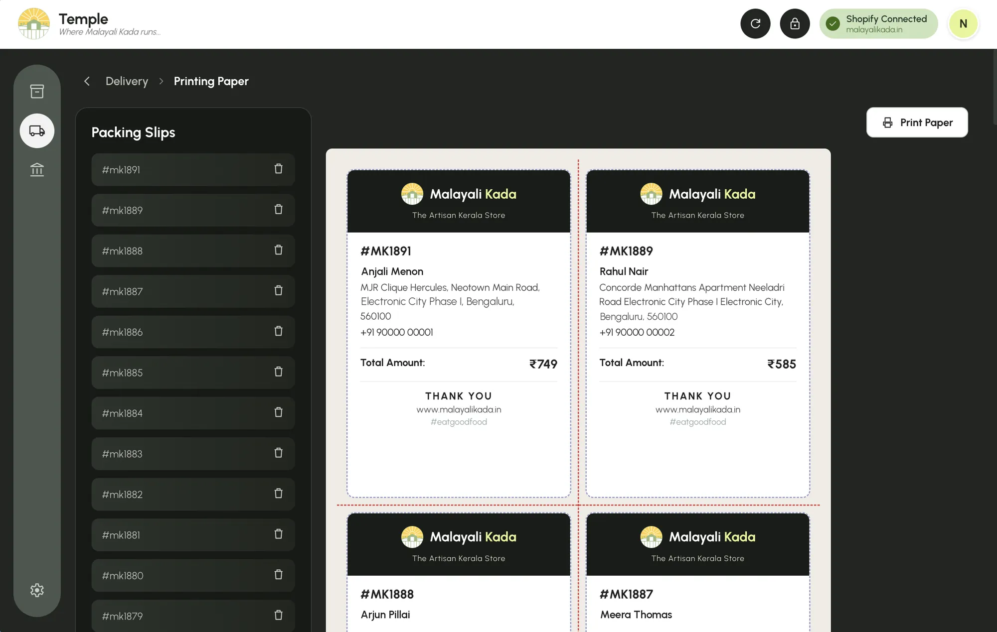
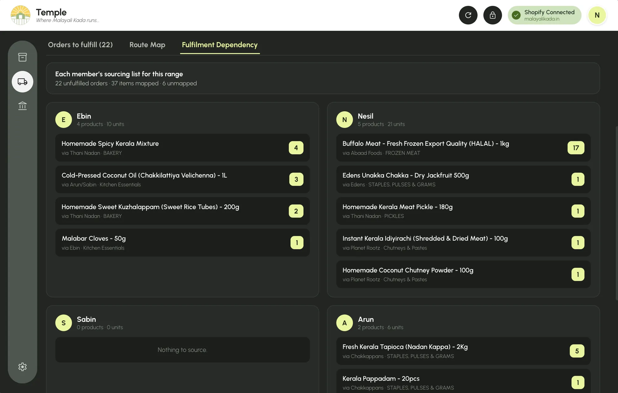
Unfulfilled orders become one list per founder, using the owner column of the sourcing sheet. Shopify titles and sheet names never match exactly, so a matcher compares word sets; I tested it against 24 real product titles before it shipped. Anything it can’t place is listed as unmapped: a to do for the sheet. Lists show Shopify’s name, because that is the name the packer reads.

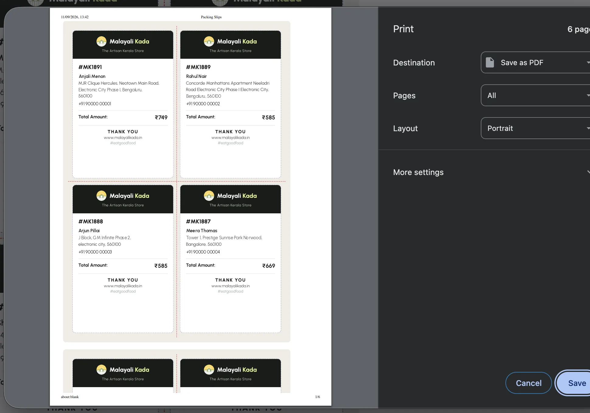
On a phone the preview is scaled to half, so a whole sheet fits the screen. The print always comes out full size, because it renders in its own window with its own styles. Red dashed guides mark the two cuts. The slip carries the Malayali Kada logo, not Temple’s: members see the slip, never the tool. One tap adds every order to the print queue.


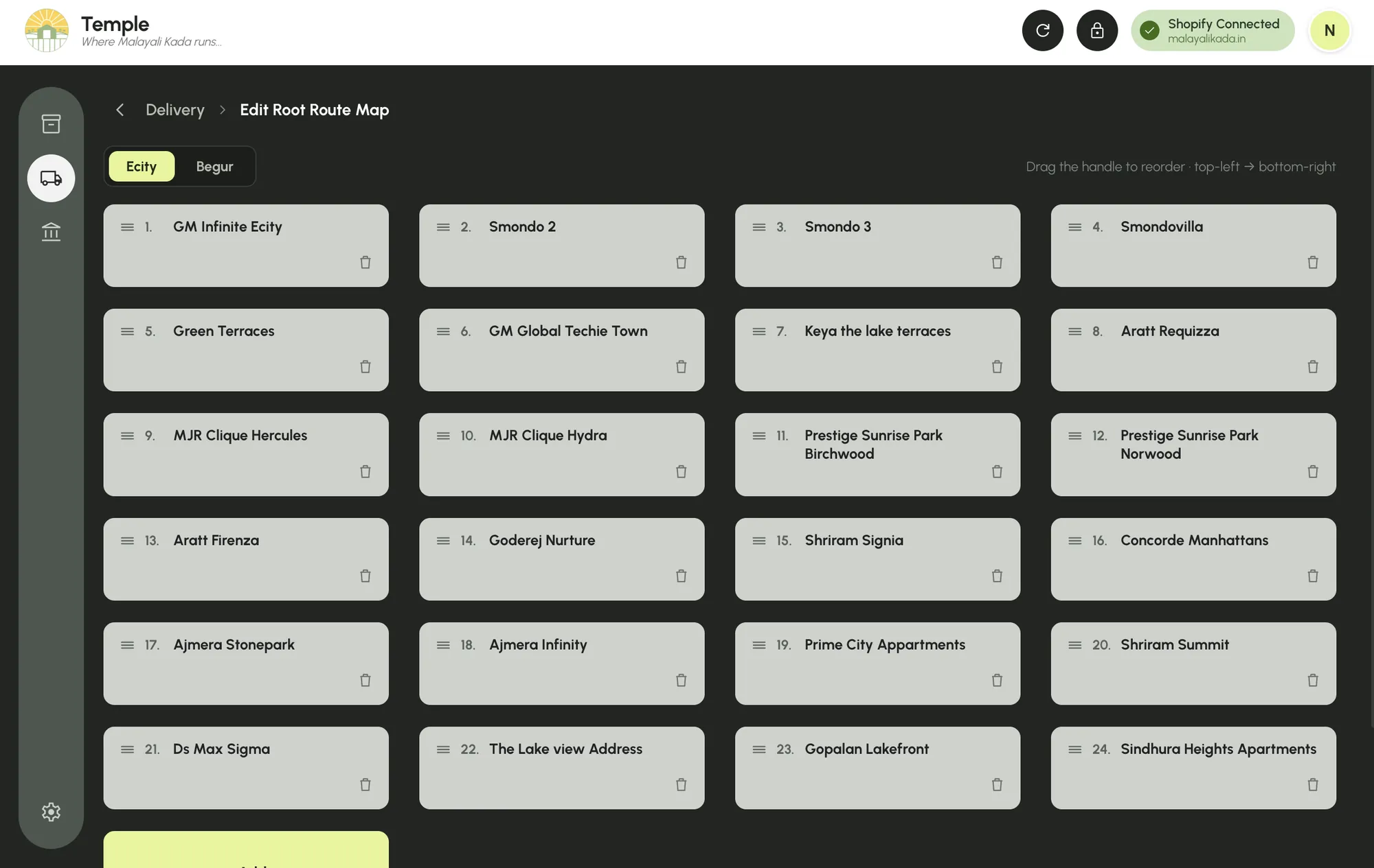
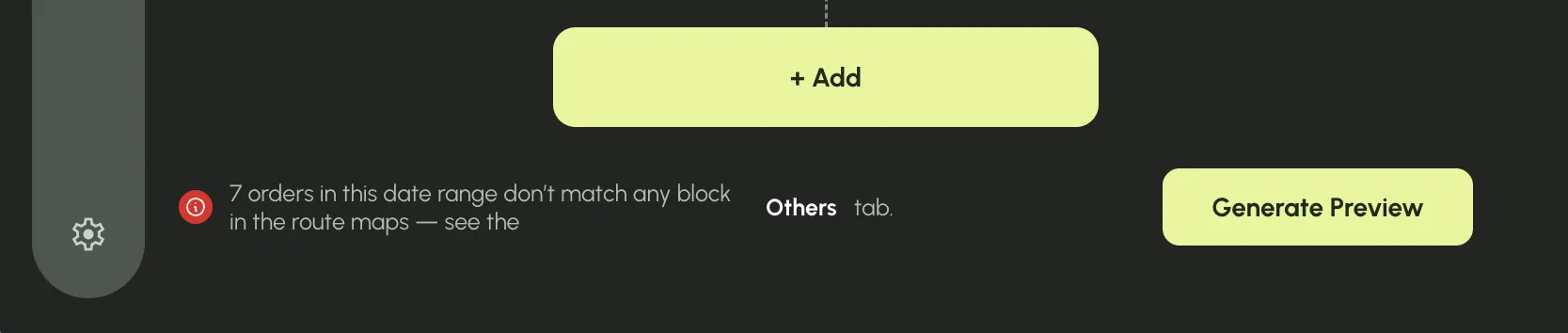
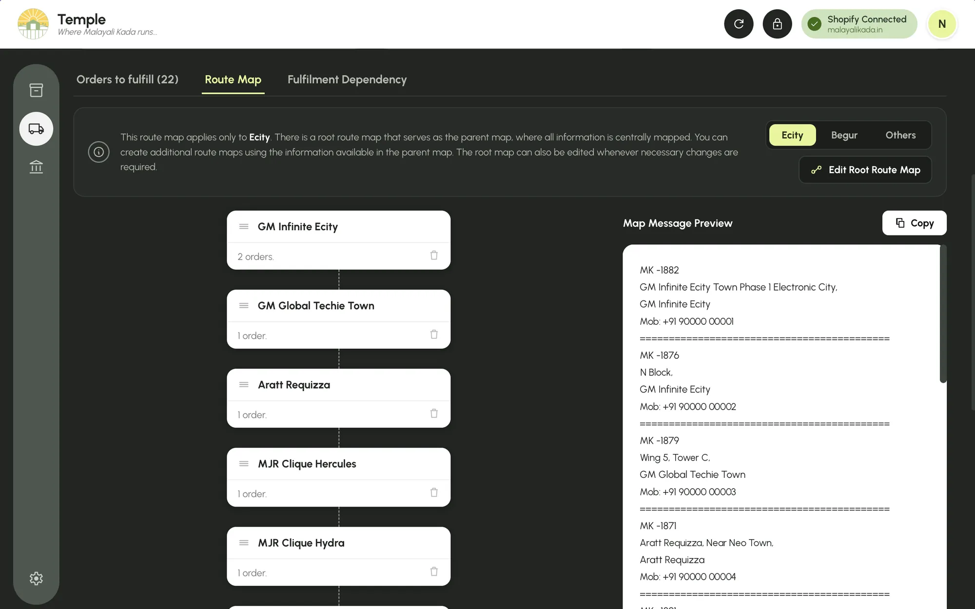
Each region has a root route map: its buildings, in the order they are driven. Temple scans every address for a building on those maps. Anything unmatched goes to Others, which turned from a dumping ground into a to do list of orders that aren’t on a route yet. Pincodes are still stored, but never used to route.


The delivery person has no login and needs none. Generate Preview writes one message with the order number, address and phone for every stop, in route order. Copy, paste, send. The design goal was an output someone else can use without ever learning Temple.

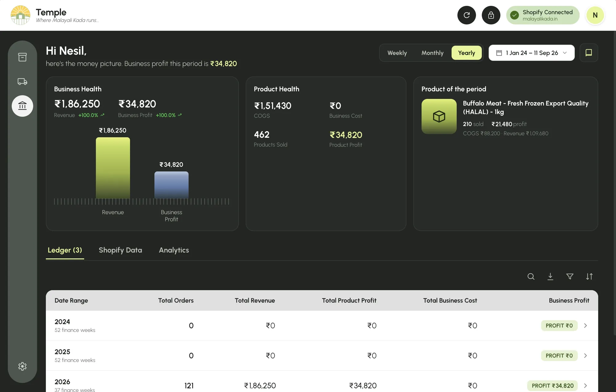
The ledger runs on our own finance week, Saturday to Friday 10 pm IST, and rolls up to months and years. Revenue is the price Shopify recorded at checkout. Cost is frozen per order line the first time Temple sees it, so a cost edit in the sheet only affects orders after the edit. Tips are excluded, and a 500g pack can never match the 1kg row.

Temple’s cards sit on a near black green, and every table inside them is light. The switch is deliberate: the dark carries summaries you glance at, the light carries rows you read. One accent, a pale lime, marks what needs action: the active tab, the primary button, the figure that matters.
Hi Nesil,
Urbanist Bold · 44 / 48 · the greeting that states the week’s job
welcome to MK Temple. You have 22 orders to fulfil
Urbanist Regular · 22 / 31 · one count, coloured, so the number is the sentence
55%
Matrix Sans Print, used once: the inventory health numeral. Shown here in Doto, a close dot matrix cousin.
A second typeface, allowed exactly one job. Health is the one number that should look like an instrument reading, not a label.

After the first mobile pass I logged five bugs: a sticky bar covering content, a clipped print popup, a calendar running off screen, cramped drag handles, a table that wouldn’t reflow. The fixes for all five already existed. Our devices measured 768 to 820 pixels wide, just above the 760 breakpoint, so they were being served the desktop layout. Moving the breakpoint to 900 fixed all five at once.
No time study was run, so this is qualitative. The founders’ own estimate is that the weekly routine now takes hours less. [METRIC NEEDED: weekly prep time before and after Temple, as a founder estimate, and who did the work]
Retired
Not solved
The Order Health badge compares this week’s unfulfilled orders with last week’s total orders, so its percentage means nothing. And years with no orders are labelled “PROFIT ₹0” with a +100% badge, when they should read as no data. Both are on the fix list; I’d rather show them than crop them out.
Pincode routing was the most expensive mistake in the build, and it came from designing around the data I had instead of the job being done. The route map, the order of buildings on an actual drive, was the real model all along. Next time I’d map the physical routine first and fit the data to it second.