Design SystemShipped

A system named after its own history, rebuilt around what things do.

upGrad's design system was seven years old. Of the 299 tokens inside it, 276 were named for a different brand in the group. We rebuilt the foundations, put them on a typeface anyone in the company can install for free, and shipped the new upGrad homepage on top. All of it in one month.

upGrad · Design System · 2026
276/299
tokens in the old system carried a prefix inherited from another brand

Role
Lead designer
Team
2 designers, 1 PM, the CPTO. Founder in review calls.
Duration
One month, foundations to homepage live
Scope
Foundations, type, colour, states, components, documentation, homepage
Context

A decade of acquisitions has to eventually look like one company.

upGrad started in 2015 as a single online higher education product. It is now one of Asia's largest integrated skilling companies, with more than 9 verticals under one entity: upGrad, KnowledgeHut, Centum Learning, upGrad Enterprise, Talentedge, upGrad Abroad, upGrad Campus, GATE Academy, Internshala and most recently Unacademy. Around 6,800 people work there.

FY26 gross revenue was reported at 219 million dollars, EBITDA rose more than eightfold, and losses halved for the third consecutive year. That is the moment this project existed in: a company consolidating, and needing one face rather than nine.

The problem

The system was not broken. It was named after its own history.

The existing system was built six to seven years ago, for a company that sold one kind of product to one kind of learner. Since then the surface has multiplied and the use cases moved past what the system could answer. Designers were making the same decisions again, individually, because the system had no position on them.

I audited the library directly and counted where every token came from.

Named for KnowledgeHut Named for upGrad
299
tokens in the old system
276
carrying a KnowledgeHut prefix
23
carrying an upGrad prefix
Evidence

There was no research budget, and that changed what the work could claim.

No user study ran for this. What was real was the file itself and the team's repeated experience of it. I audited the existing library, counting tokens and tracing where each one came from, alongside a running list of moments where the system had no answer.

The limit of that evidence is that it describes the designers' problem, not the learner's. So the goals were set where the evidence actually reached: consistency, speed, and whether a designer who was not in the room could use the system without asking anyone.

A design system nobody can install is not a design system.

The brief read as a visual refresh. The real problem was adoption. In a company this size, with this many verticals, a system succeeds or fails on whether a designer three teams away can pick it up on a Tuesday without a licence, a handover call or a question.

Explorations

We traded a preference for a guarantee.

Three typefaces were on the table. Circular was the aesthetic favourite. It is also commercially licensed, which means every designer needs a paid seat and a manual install before they can open a file correctly. Across this many verticals that is not a small friction. It is the mechanism by which a system quietly stops being used.

Rejected
Circular

The aesthetic favourite. Commercially licensed, so every designer needs a paid seat and a manual install before the file opens correctly.

Rejected
Poppins

Free and available, but geometrically wide and already the default of a thousand edtech brands. Availability without any distinction.

Chosen
DM Sans

Free, open source, variable, with an optical size axis. Installable by anyone in under a minute. The guarantee that the system can actually be used.

The counterweight

A free geometric sans is correct and forgettable.

DM Sans alone would have been safe. The brief asked for freshness. So the system carries a second face: Fraunces, SemiBold Italic, permitted only at Heading 1 through Heading 3. Character in one controlled place instead of a new identity everywhere.

The brand itself could not move. The instruction was that users should not feel a lot of change, so the red stayed exactly where it was and the mark was untouched. The ramp was built around the existing colour, which is why brand red sits at red 300 rather than at the tidy midpoint of the scale. Everything that changed was structural.

Decision 01

Name tokens by role, not by origin.

The old system named tokens after where they came from. The new one names them after what they do. This is what stops the next acquisition from leaving another prefix behind.

--kh-spacing-half
--kh-spacing-1
--kh-spacing-2
--kh-spacing-4
--kh-spacing-8
--kh-spacing-32
a numeric ladder, prefixed with another brand, anchored to one desktop width
text-primary → neutral/black
text-secondary → neutral/500
surface-brand → red/300
border-primary → neutral/150
icon-success → green/400
button-primary-pressed → red/700
a role, and the primitive it resolves to, on every row
Craft close up

Every semantic row carries the primitive it resolves to.

Four layers, not two: primitives, semantics, and then a separate primitive and semantic pair for data visualisation. The alias column is the argument of the system made visible. A designer reads the role and sees the source in the same line.

NameFillHexAlias
NameFillHexAlias
NameFillHexAlias
Decision 02

Interaction states belong to the system, not to whoever builds the component.

Ten tokens covering default, hover and pressed across three button types, plus disabled. Most systems leave these to the person building the component, which is how three different hover reds end up in one product.

Default
Hover
Pressed
Primary
Secondary
Accent
Live token behaviour: red 300, red 600 on hover, red 700 on press.
Decision 03

A scale small enough that people stop looking styles up.

Sixteen core styles and five for data visualisation. The core scale runs on percentage line heights. The data visualisation scale runs on fixed pixel line heights, because percentage leading does not hold alignment against a chart axis.

Decision 04

The phone stopped being a derivative of the desktop.

The old system defined a single scale anchored at 1440 and up. The new one defines two base frames, each with its own column structure.

Outcome

The homepage shipped on it, reviewed by the founder.

The system and the homepage adaptation were done in one month. The new upGrad homepage is live, built entirely on the new foundations, and the founder was directly involved in the design review calls. That is the closest thing this project has to a real adoption test: the system met the highest level of scrutiny in the company and shipped anyway. Other pages are being rebuilt on it now.

1
month from foundations to a live homepage
4
token layers: primitives, semantics, and the same pair again for data visualisation
21
text styles across two scales, on two typefaces
Since launch, click activity and scroll depth on the homepage have both moved up. No controlled experiment ran against the old design, so the direction is observed rather than isolated. The real result here is adoption and speed, not conversion.
What I would change

I documented the system by hand, and the documentation drifted first.

The tokens themselves are bound variables and they behave correctly. The reference tables that explain them are typed text. Inside the first cycle they already drifted: the primitive ramp and the button tokens now disagree about which red is red 500.

Next cycle the documentation gets bound to the same variables it describes, so the reference generates itself instead of being retyped. The old system did not fail from bad decisions. It failed from seven years of nobody owning the next one, which is why the cadence was set at launch: core fixed, components and refinements once a year, deliberately.

Year one, shipped

Foundations, typography, colour and states, core components, the homepage.

We are here

Further pages migrating onto the system, one at a time.

Shipped

The new upGrad homepage, live and built on the system.

Every red on this page is surface-brand. Every button moves through the three states defined once in the token layer. The hero carries Fraunces at Heading 1 Accent, which is the one place the system permits it, and it is doing exactly the job it was designed for: character in a controlled position, on top of a foundation anyone can install for free.

Captured from the live site. Drag or scroll the strip.

upGrad homepage hero with the headline For Your Every Next Opportunity set in the Fraunces accent italic, over a video background, with the course search field and category pills
Hero. Heading 1 Accent, the only place Fraunces is allowed.
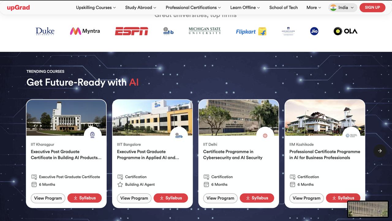
Trending courses section on a dark navy background with four university programme cards
Programme cards. One card component, one radius, one button pair.
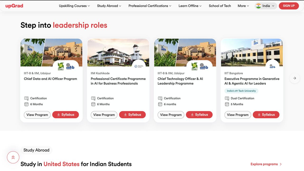
Step into leadership roles section with four programme cards on a light surface
Same card on surface-surface. The system holding across two backgrounds.
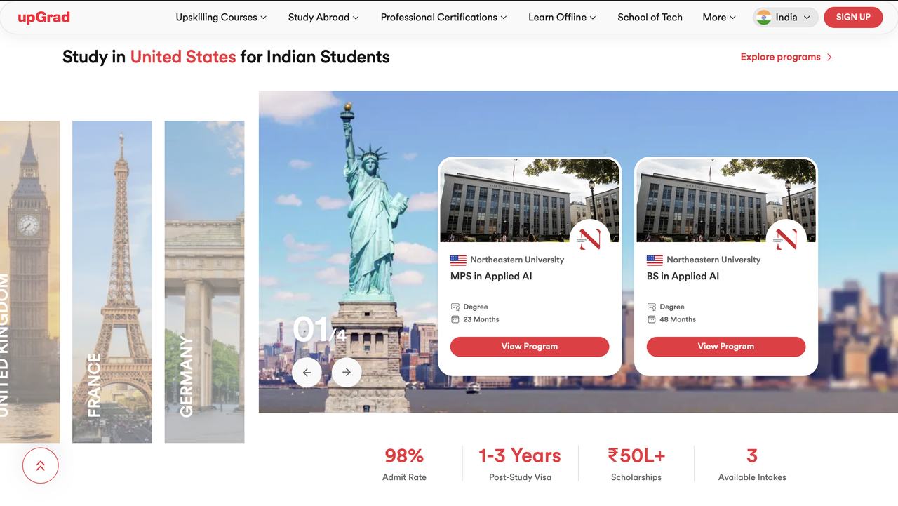
Study abroad section with a country carousel and two university programme cards
Study abroad carousel, where the system started before it was promoted.
Dark banner promoting the IIM Bangalore young leaders programme, and the free courses tab set
Inverse surfaces. text-inverse-primary and the accent button.
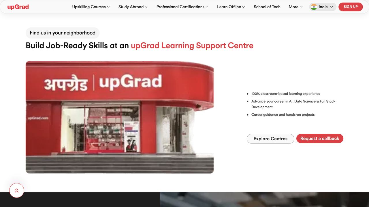
Learning support centre section showing an upGrad storefront photograph beside a bulleted list and two buttons
Secondary and primary buttons side by side, exactly as the tokens define them.
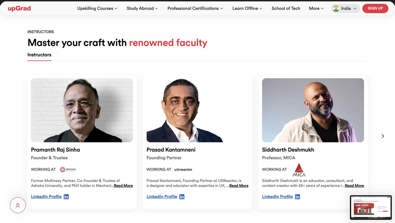
Instructors section with three faculty cards showing photographs, names, roles and links
A third card variant built from the same spacing and radius rules.
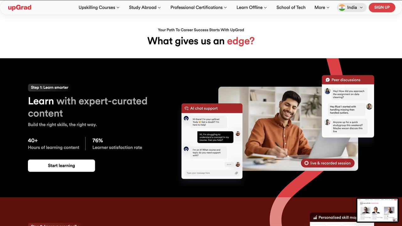
What gives us an edge section on a black background with a step one panel, statistics and a product illustration
Full inverse section. The neutral ramp carrying an entire dark surface.
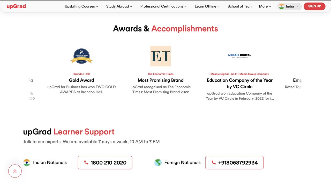
Awards and accomplishments row followed by the learner support contact section
The tail of the page. Quiet, and still on the same grid.